Slum Sociable: Music Branding
Challenge
Create a typographic logo for a little-known musician, as well as album cover art for three different songs.
Process
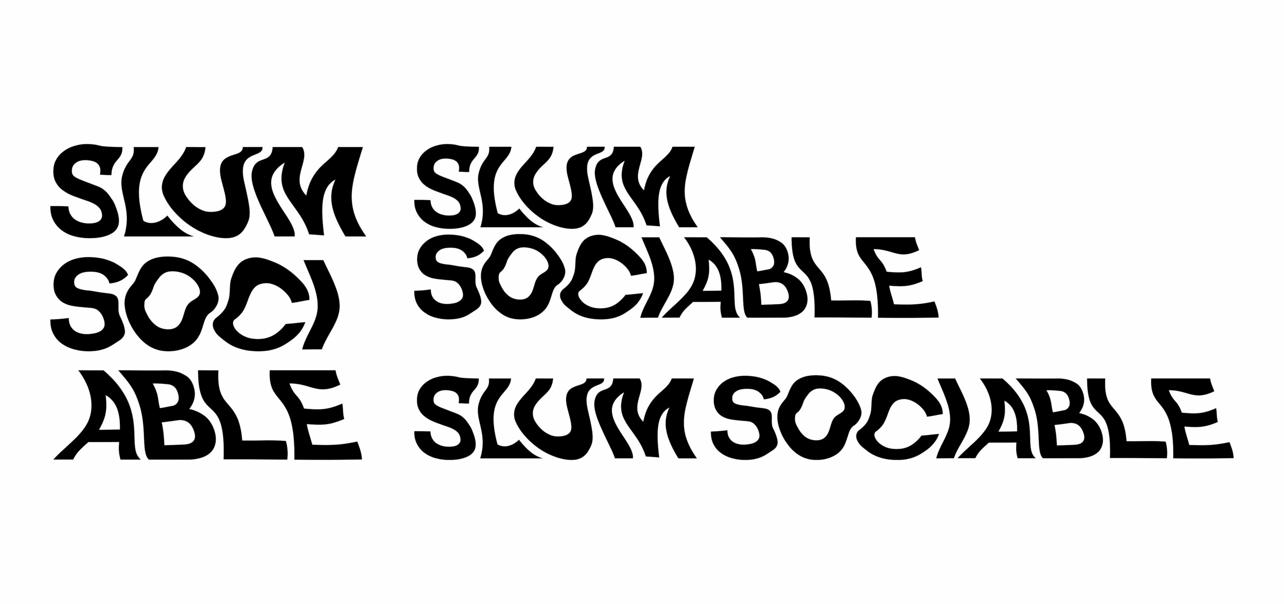
I chose the alternative/indie band Slum Sociable. Their music is electronic, retro, grooving, smooth, loose, and layered. The logo combines these aspects, capturing movement but remaining smooth and clean. Using Helvetica but warping it allowed for a final logo that synthesizes retro and modern aesthetics.
Process
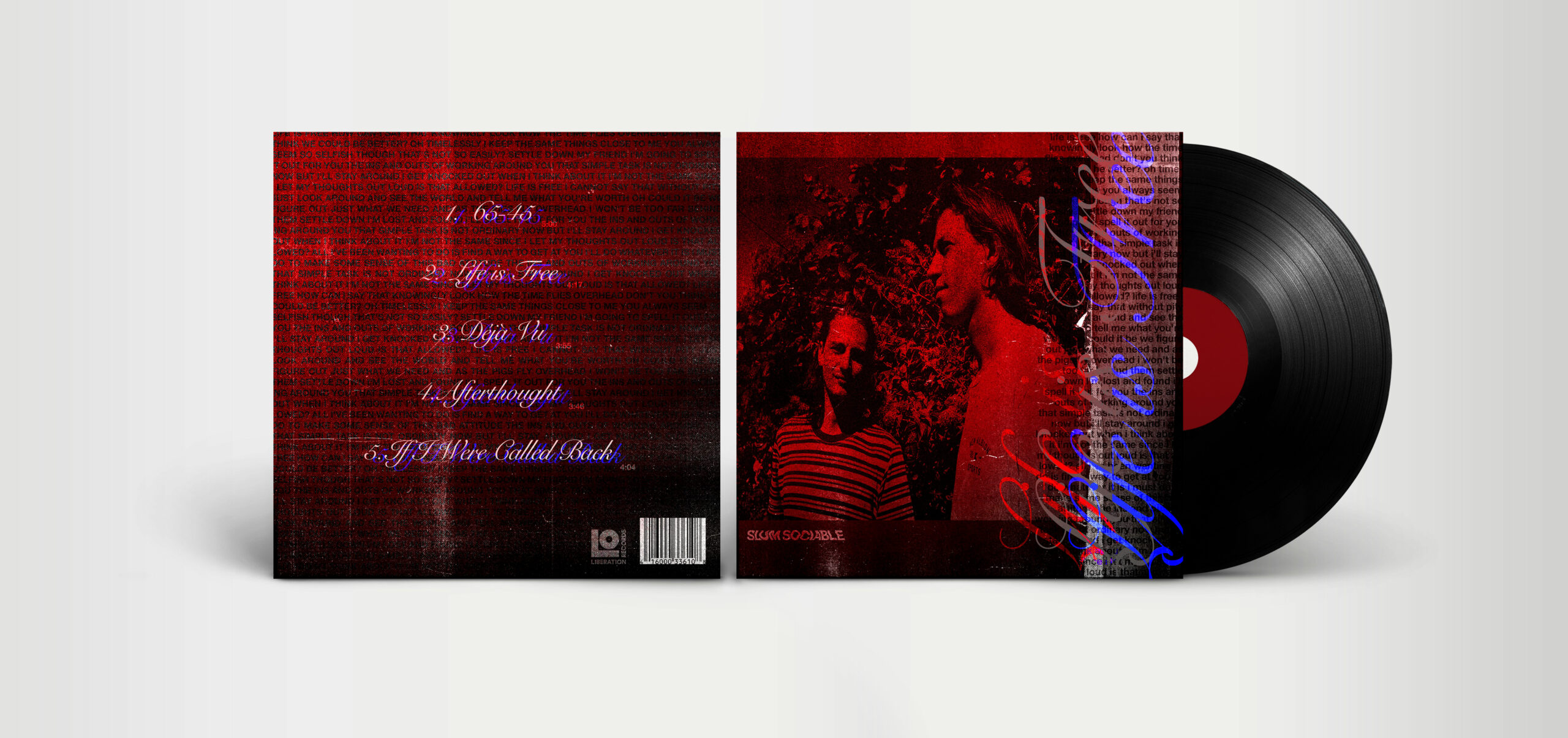
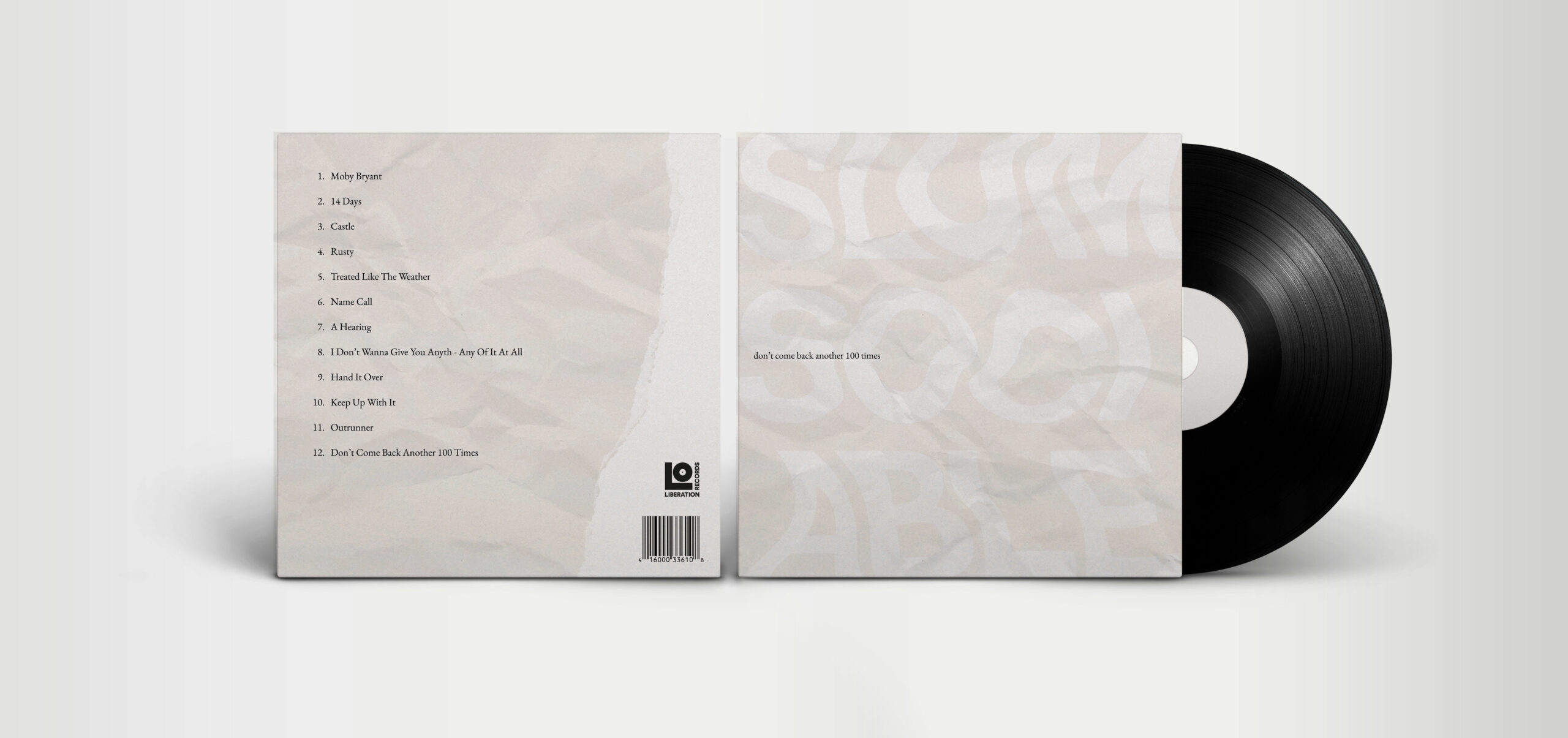
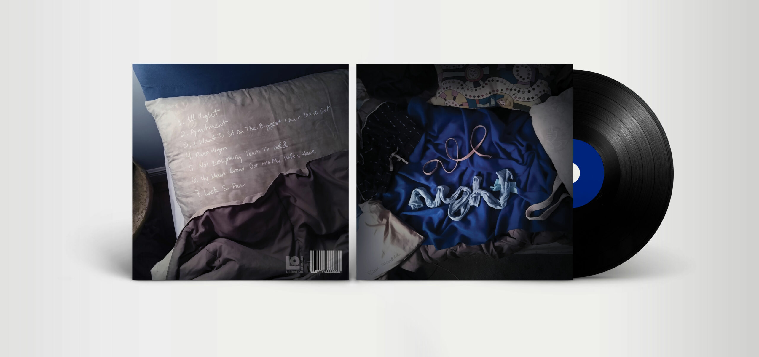
Each album cover takes aesthetic inspiration from the sound and lyrics of the song. “Life is Free” has a red and blue color palette to emulate sirens, since the song has a siren-like sound that makes it feel cyberpunk and dystopian. “All Night” is a photo of an unmade bed lit by lamplight to symbolize staying up all night, and “Don’t Come Back Another 100 Times” makes use of minimalism and negative space to represent its clean, slow, sweeping melodies.
Results
The final result of the project is three front and back CD or vinyl case designs, each based around a different song. The designs also make use of the band’s new logo, adding continuity to the branding.